


Fonts and Styles
The 5 Best Graphic Design Trends to Apply Today
Read More
/24 Jul 2025
/ 24 Jul 2025
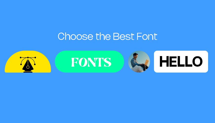
Your brand needs a look that stands out. One big part of this look is the font you use. A font is the style of letters you see. Think about the words on a soda can or a favorite book. The way those words look can make you feel something. Picking the right font for your brand is important. It helps people know who you are and what you stand for. This simple guide will show you how to choose the best font.
A brand font is the main text style your business uses. You see it on your website, business cards, and social media. It is like the voice of your brand. Just like people have different voices, fonts have different feelings. Some fonts feel serious. Others feel fun and friendly.
For example, a bank might use a strong, clear font. This shows they are trustworthy. A toy store might use a playful, round font. This shows they are fun for kids. Your brand font helps tell your story without saying a word.
Picking the right font matters a lot. Here are a few reasons why:
Shows who you are: Your font helps share your brand's personality. Is your brand modern or classic? Serious or relaxed? The font can show this.
Makes you look professional: A good font makes your brand look put-together. It shows you care about details. This builds trust with your customers.
Helps people remember you: When you use the same font everywhere, people start to link it to your brand. It helps them remember you easily.
Makes reading easy: The best fonts are easy to read. If people can't read your words, they might just leave. Good readability keeps them around.
Choosing a font might seem hard. But you can follow some easy steps.
Before you look at fonts, think about your brand. What words describe your business?
Is it old-fashioned or new?
Is it fun or serious?
Is it fancy or simple?
Is it strong or gentle?
Write down 3-5 words that fit your brand. For example, a coffee shop might be "cozy," "friendly," and "warm." A tech company might be "innovative," "clean," and "smart." These words will guide your font choice.
There are different types of fonts. Knowing them helps you pick.
Serif Fonts: These fonts have small lines or "feet" at the ends of letters. Think of books and newspapers. They often feel classic, trustworthy, and old-school. Times New Roman is an example.
Sans-Serif Fonts: "Sans" means "without." These fonts do not have the small lines. They look clean, modern, and simple. Arial and Helvetica are examples. Many tech companies use sans-serif fonts.
Script Fonts: These fonts look like handwriting. They can be elegant, personal, or artistic. Think of fancy invitations. They might be harder to read for long text.
Display Fonts: These fonts are very unique. They are for headlines or special uses, not for long sentences. They can be bold, quirky, or decorative.
Think about which type matches your brand words.
It is good to see what fonts other businesses like yours use. This does not mean copying them. It helps you see what works in your field. It also helps you see how you can be different. If everyone uses a serious serif font, maybe a clean sans-serif font will make you stand out.
Once you have a few fonts in mind, test them out.
Readability is key: Can you easily read the words? Look at different sizes.
Try on different screens: Does the font look good on a phone, tablet, and computer?
Use it in headlines and small text: Some fonts work well for big titles but are hard to read when small.
You might need two fonts: one for headlines and one for regular text. Make sure they look good together.
Many brands use more than one font. Often, they use two: a main font and a supporting font.
One font might be for titles.
The other might be for body text (the main text).
These fonts should look good together. They should not clash. A common pair is a serif font for headlines and a sans-serif font for body text. This can make your brand look balanced and clear.
Show your font choices to others. Ask friends, family, or potential customers. Do they feel what you want them to feel? Do they find it easy to read? Their fresh eyes can help you make the best choice.
Picking the right font for your brand is a big step. It helps people understand your business and remember you. By thinking about your brand's personality, learning about font types, and testing choices, you can find the perfect fit. Your font is your brand's voice – make it speak clearly!